MERCHANT PORTAL BREAKDOWN
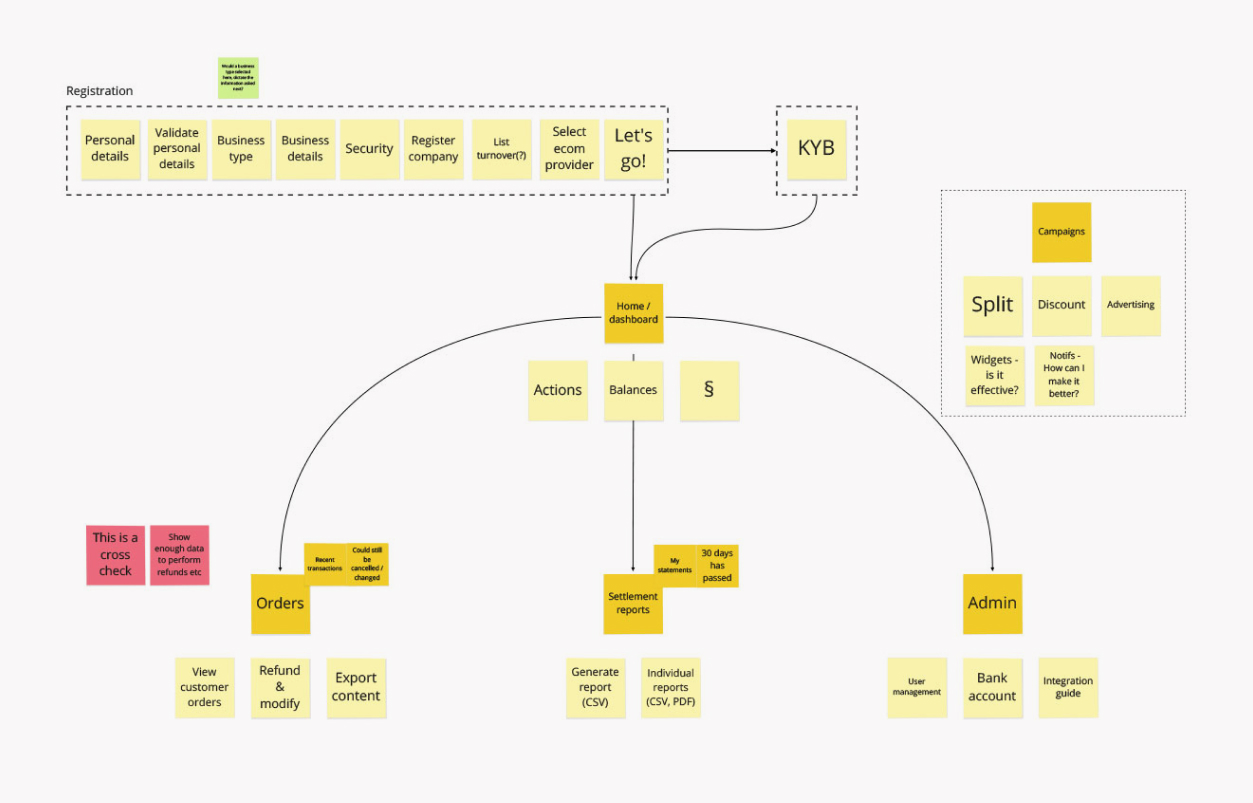
The information gathered from the kick-off session and insights from the competitor analysis were used to create a high-level breakdown of the structure of the merchant portal.
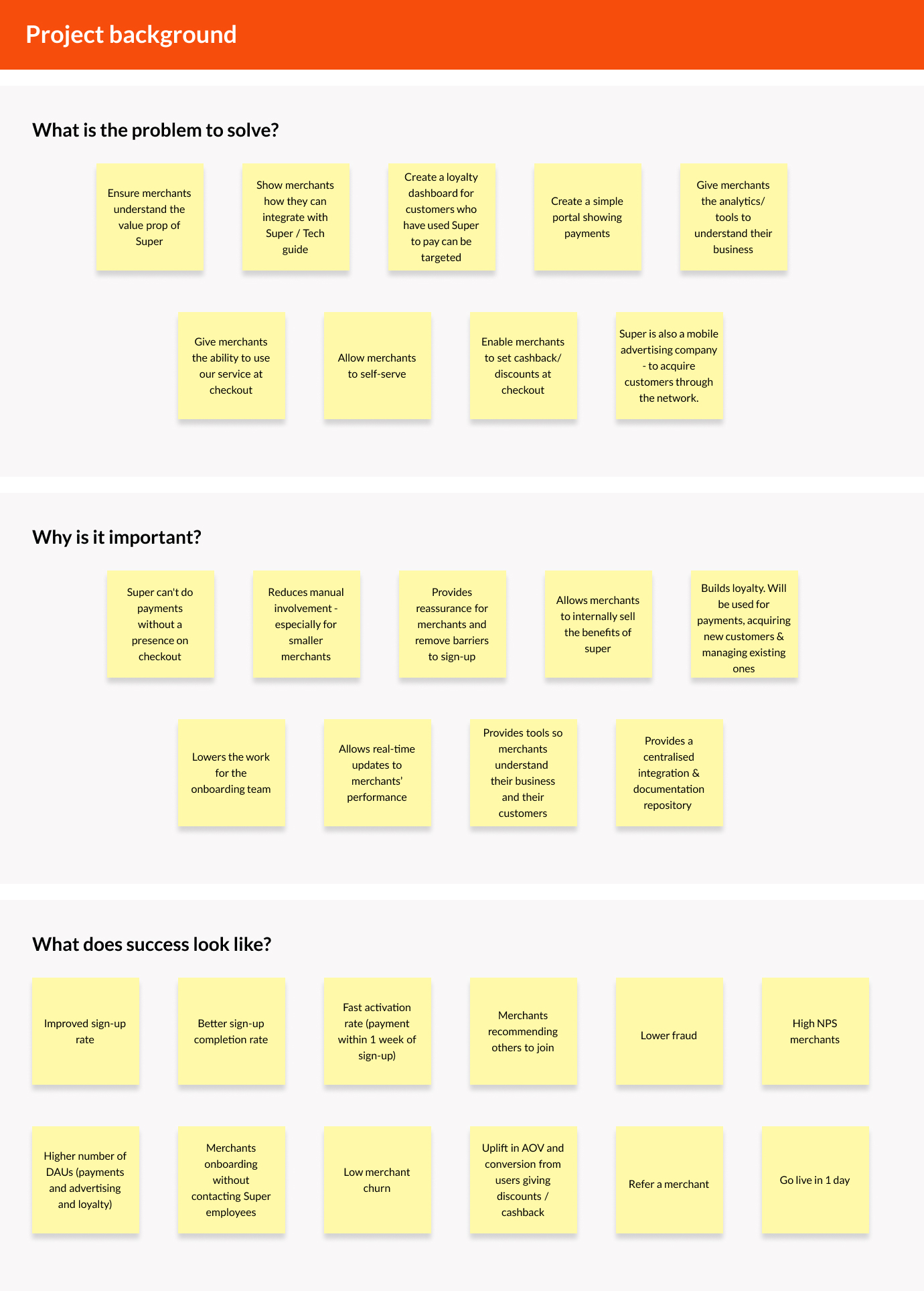
Super Payments was a new business idea to make online payments free for both merchants and consumers by using Open Banking. Passing on those savings would attract more consumers to the merchant’s site, boosting sales.
The consumer would choose to check out with “Super Payments” on a merchant’s website - like Paypal or Apple Pay.
The Merchant Portal would be a product available for a merchant to manage payments made using the Super Payments checkout option.
They would be able to:
View and manage what payments were made.
View and manage settlements.
Issue a refund.
Integrate with APIs to add the Super Payment option to their eCommerce site.
Adjust discount amounts.
The merchant portal is also intended to be used as a loyalty dashboard, to target users of the Super payment method. This mobile advertising segment to the product was descoped for this initial piece of work. The business was not fully ready to move ahead with it and it was not deemed essential for Day 1 release.
A kick-off session was conducted, using Miro, to get an understanding of the product from the view of the business. The areas included in the session were:
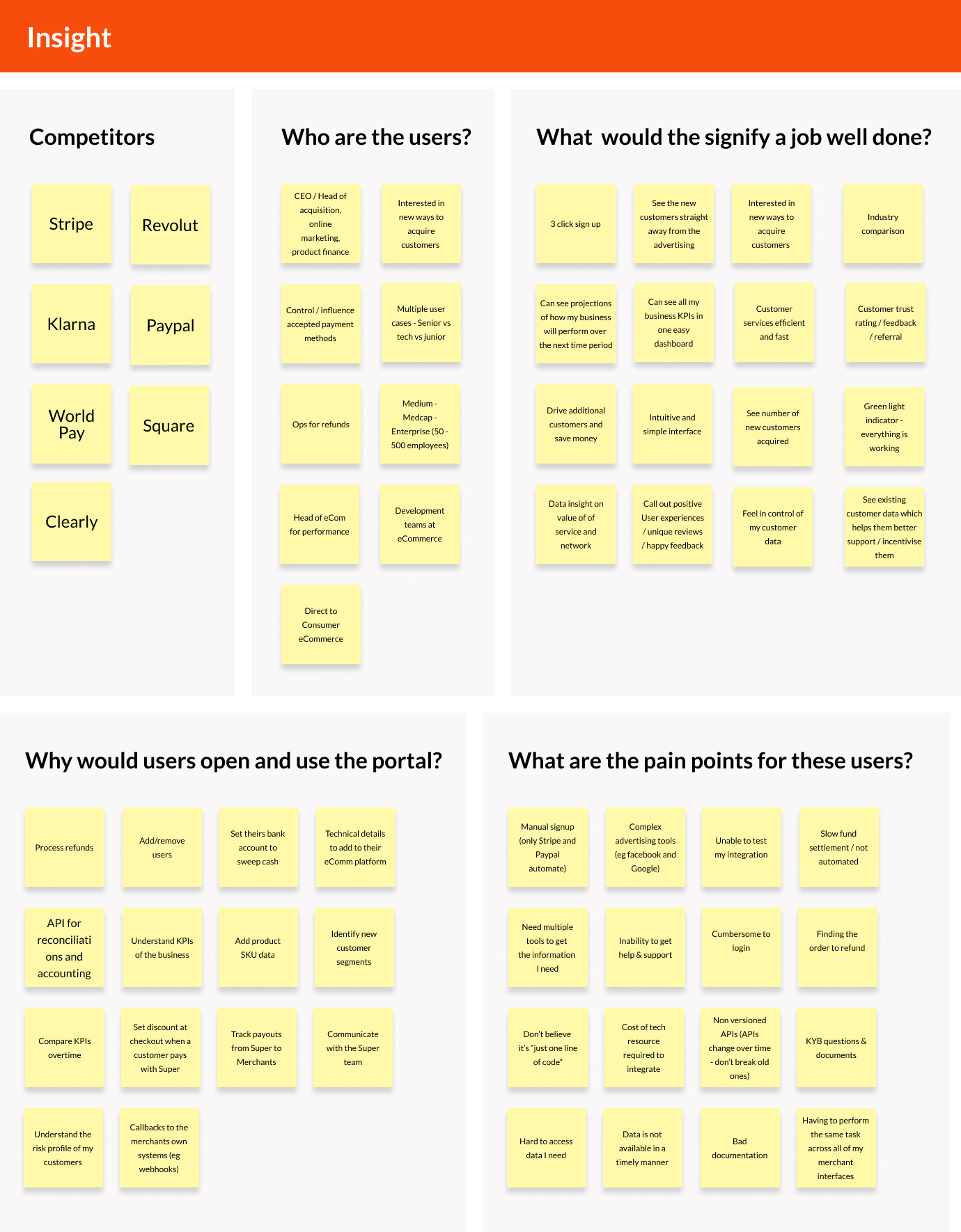
A thorough competitor analysis was carried out to look at a selection of competitors to get an understanding of what good (and bad) looked like in the merchant portal landscape. Common themes and features were highlighted which allowed us to identify strengths and weaknesses in their user experiences.
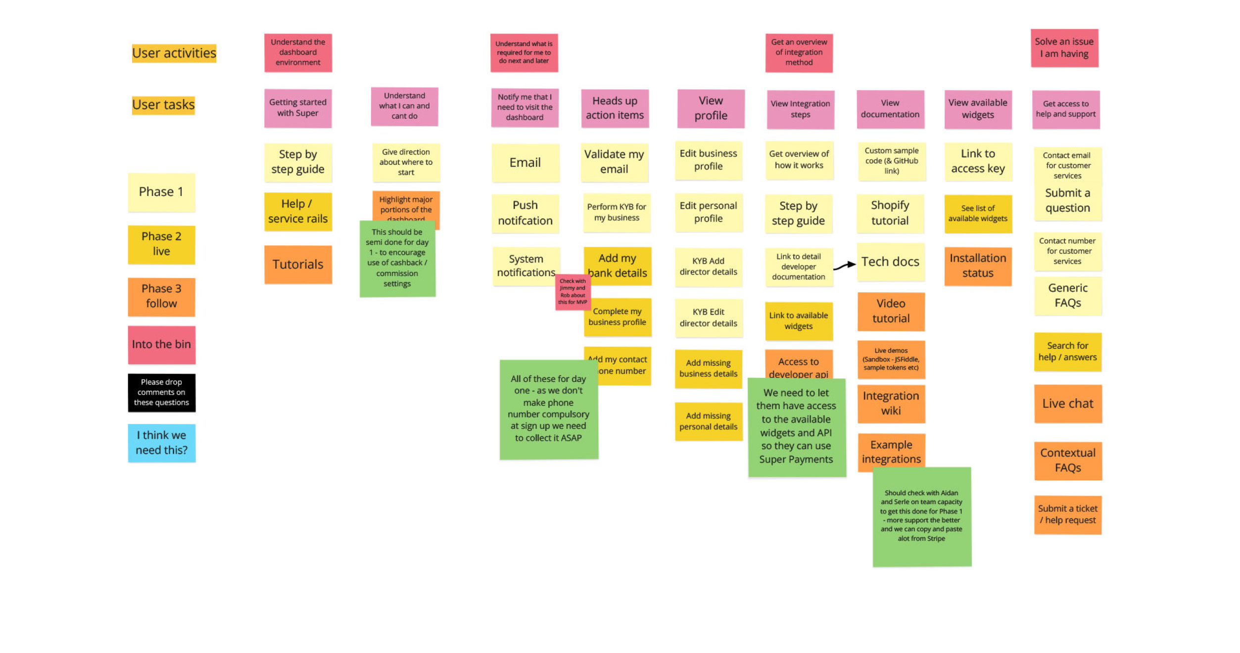
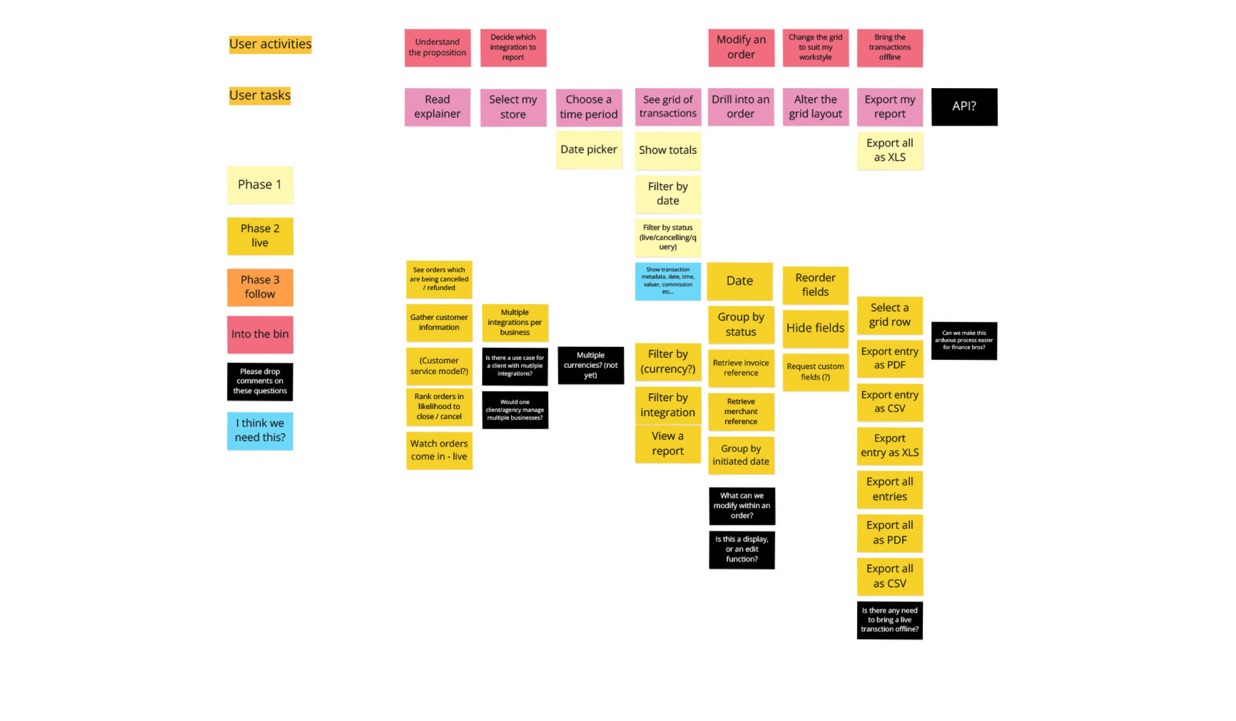
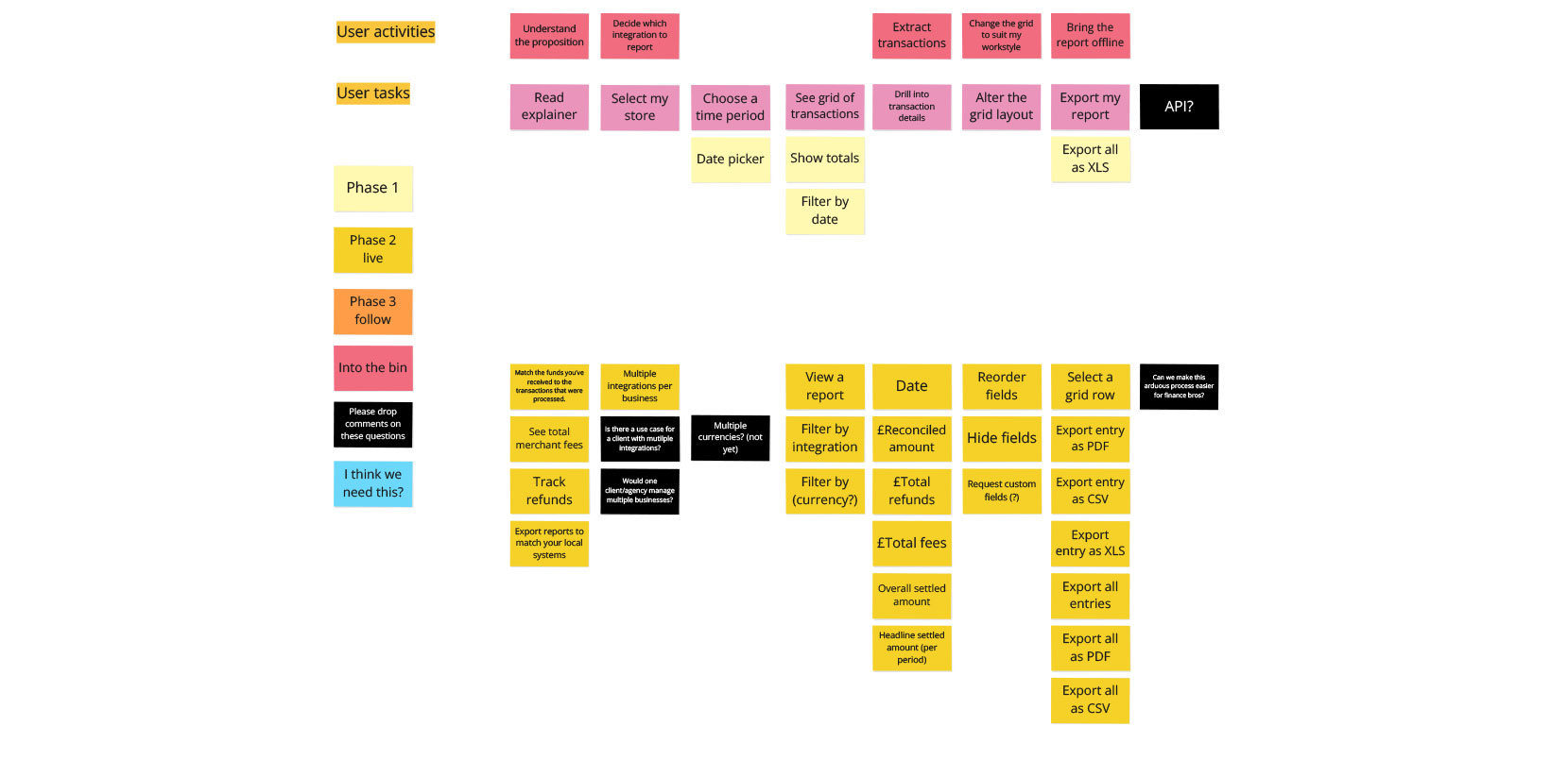
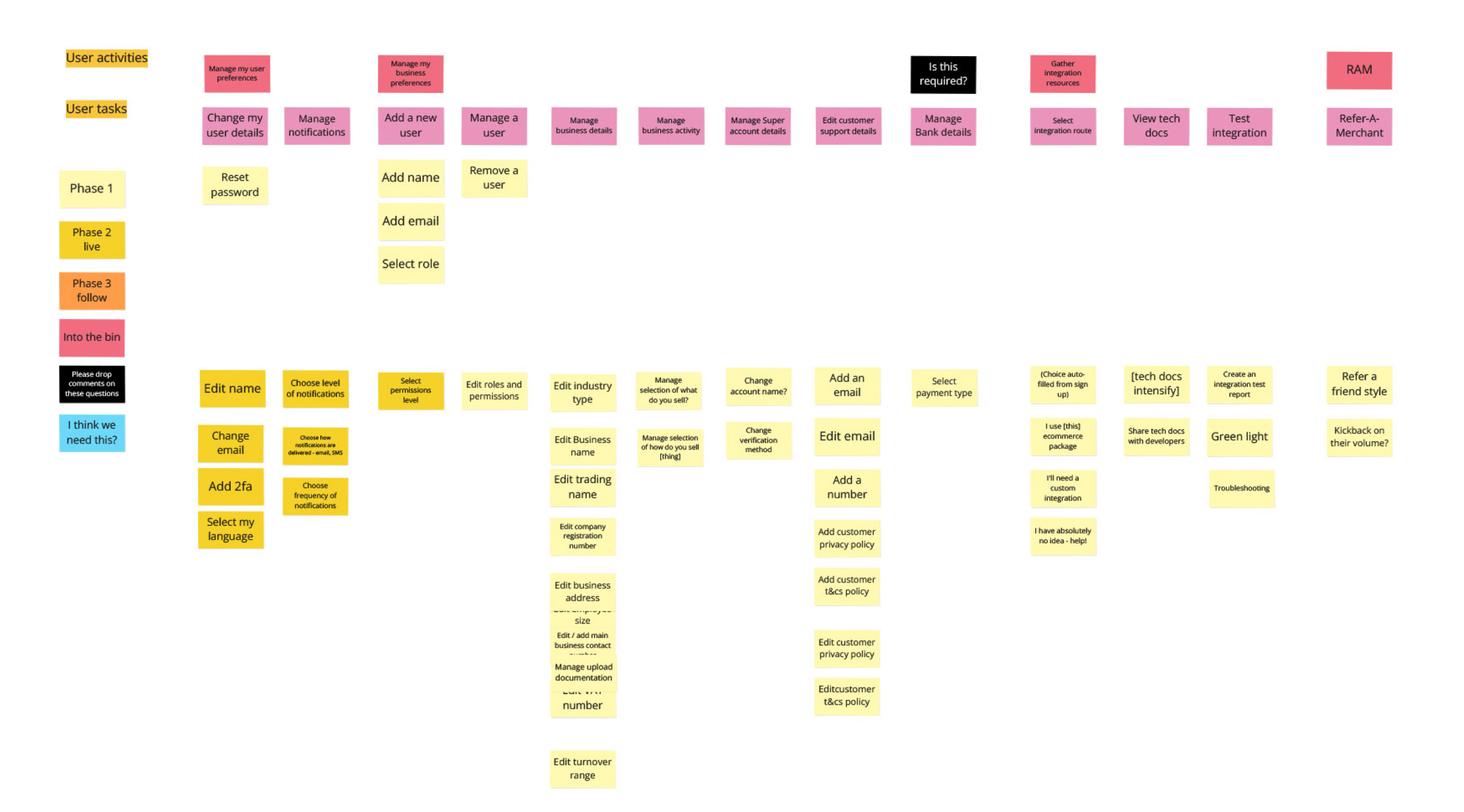
The information gathered from the kick-off session and insights from the competitor analysis were used to create a high-level breakdown of the structure of the merchant portal.
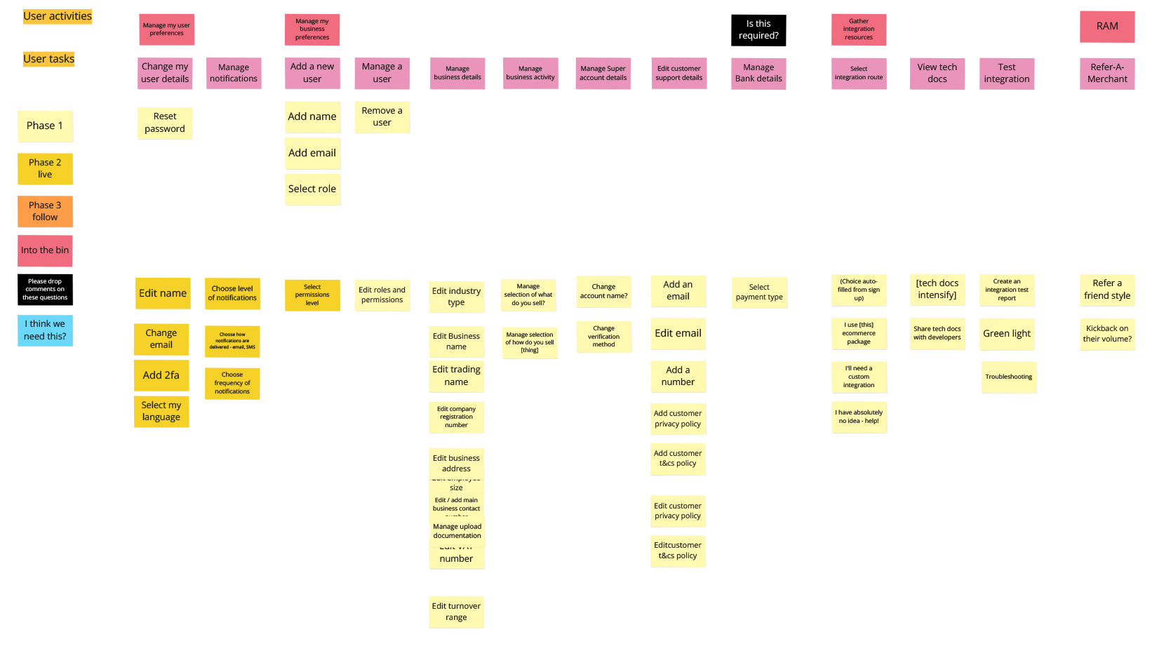
A story mapping exercise was carried out for each key section from the portal breakdown to help visualise the user journeys and get the stakeholders to make a call on what the scope was for each of the planned release phases. It was also a good validation check with the stakeholders against where I was at in the progress of the portal from the initial kick-off session and competitor analysis feedback.
The story mapping also helped align features with business goals from the kick-off session, making it easier to prioritise development tasks and deliver a more cohesive and user-centred product. The agreed scope of delivery was highlighted as Phase 1 and 2 features captured in the story mapping.
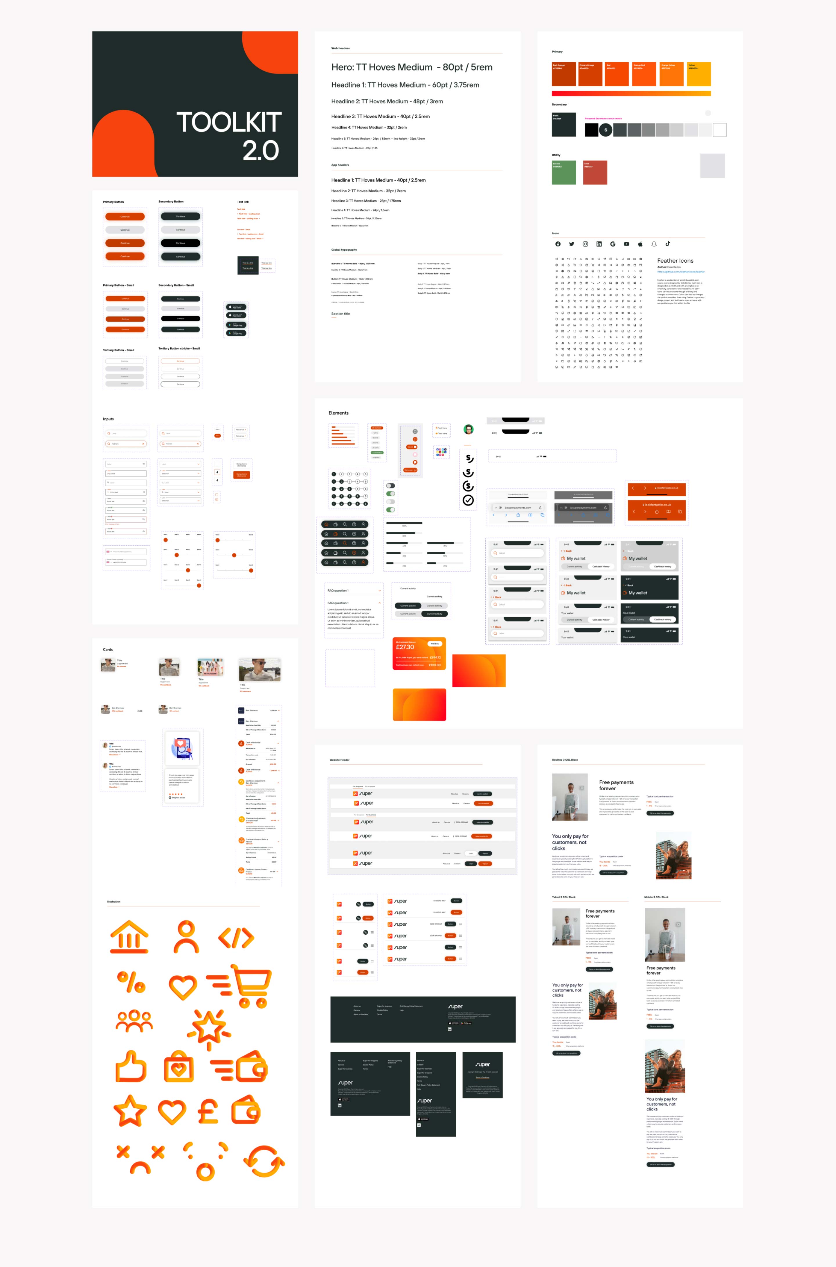
As a relatively mature design system had been established when I designed the Cashback App, it was agreed this would be used in the design phase to create hi-fidelity wireframes. There would be a need for styling and components as part of this process, but overall should be quicker way for us to get an MVP of the product up and running.
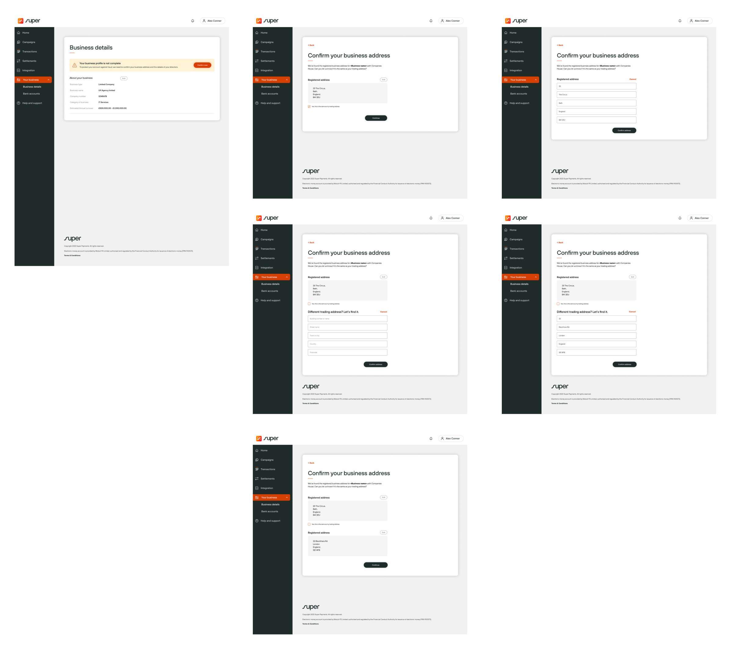
The first screen a user lands on when starting the onboarding process is simple sign-up form to capture enough details from the user to create an account. To ensure the merchant has full awareness of the value proposition of Super, the screen is split with the form on the right and the business USPs on the left. This is to help provide a merchant with user full reassurance of the product and help to remove any barriers to sign-up.
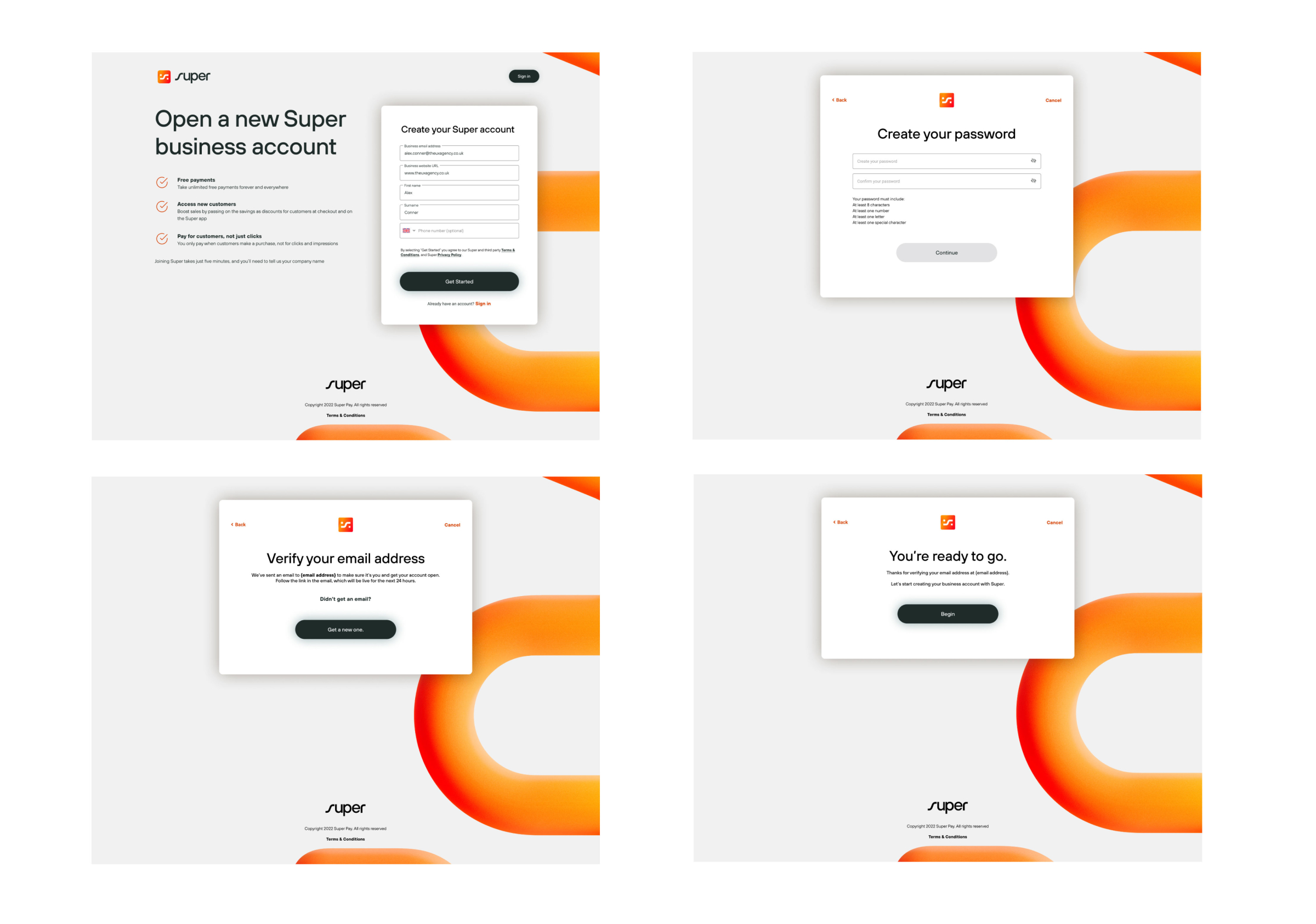
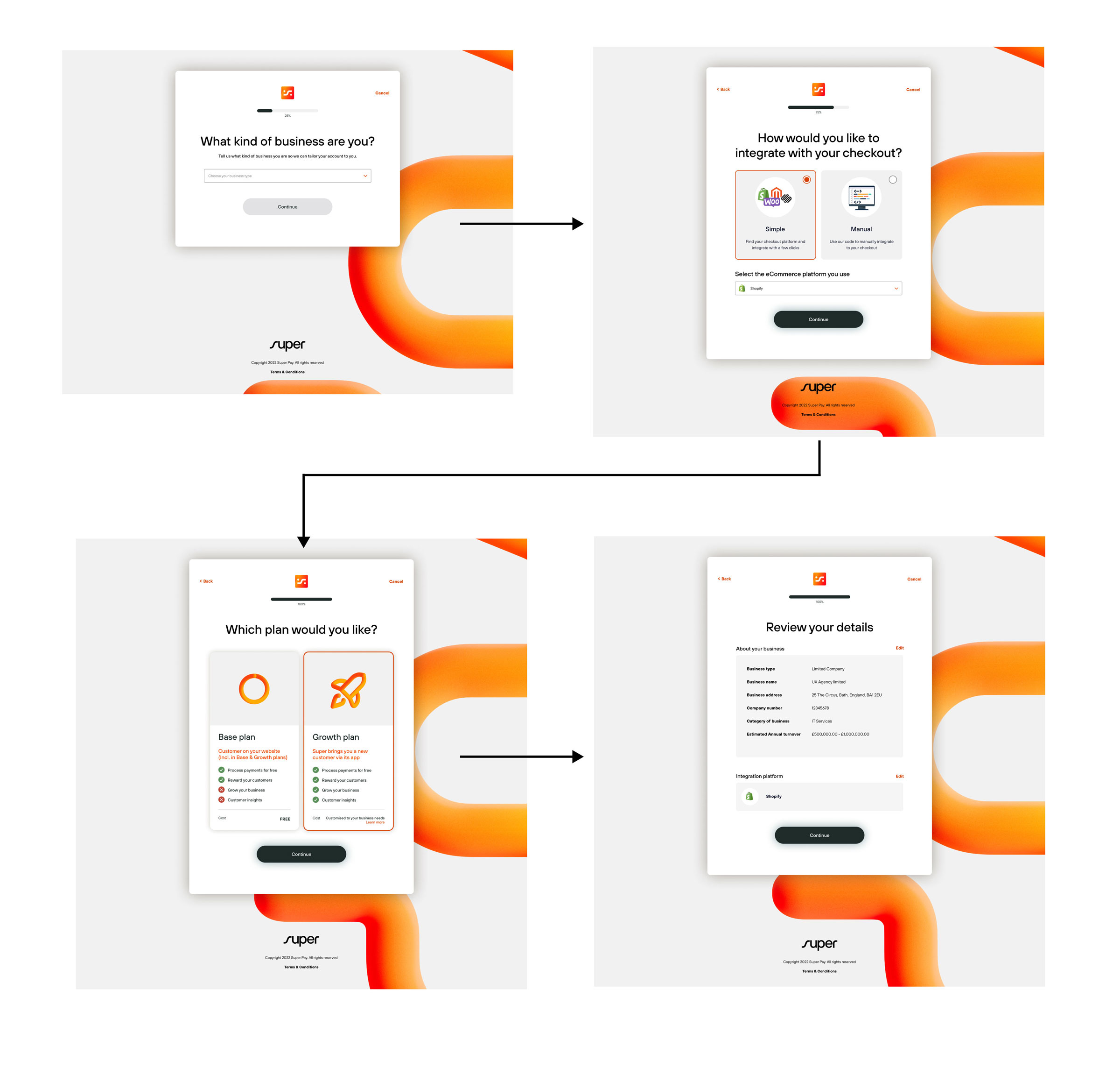
One key stipulation from the business requirements was to have a simple onboarding process that was no more than 3 steps to completion. There was some work to be done to understand what was the minimum amount of information that could be requested from the user to get them up and running, vs the amount required from a legal and compliance point of view to ensure the merchant was onboarded without a risk to Super as a business.
The self-service onboarding helps to lower the work from the onboarding team, something that was not available in the key competitors on the market, Stripe and PayPal.
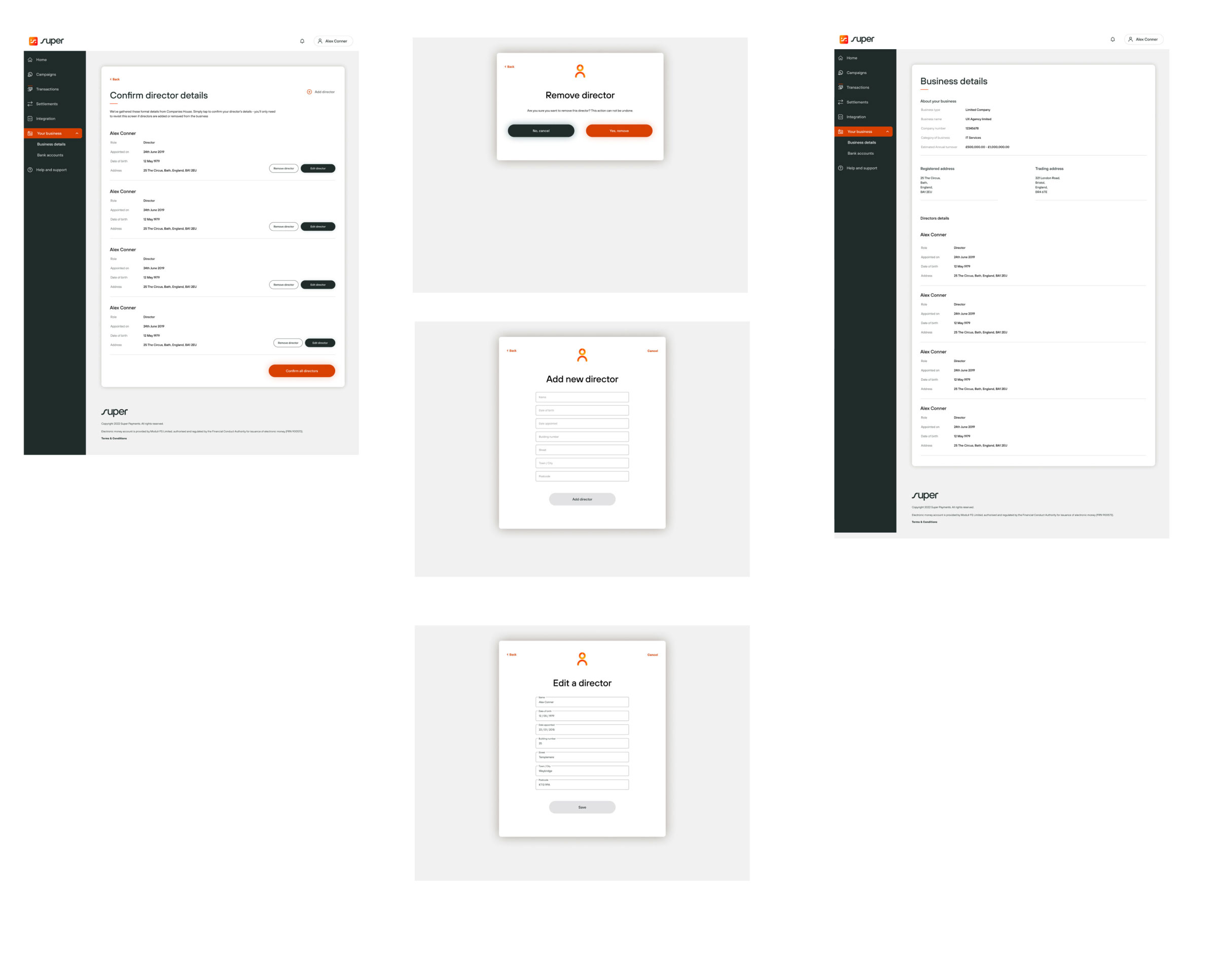
Once a merchant lands in the dashboard, has an account created and has completed the basic onboarding process, they are presented with the next set of steps that can be considered a passive onboarding phase.
They can do these steps in any order they wish. Once complete, they are fully up and running in the merchant portal. Breaking these steps down helps reduce the cognitive load of the process and allows the merchant to complete it over a period of time. Some of the details require information that a merchant may not have to hand, or elements may need to be completed by different users.
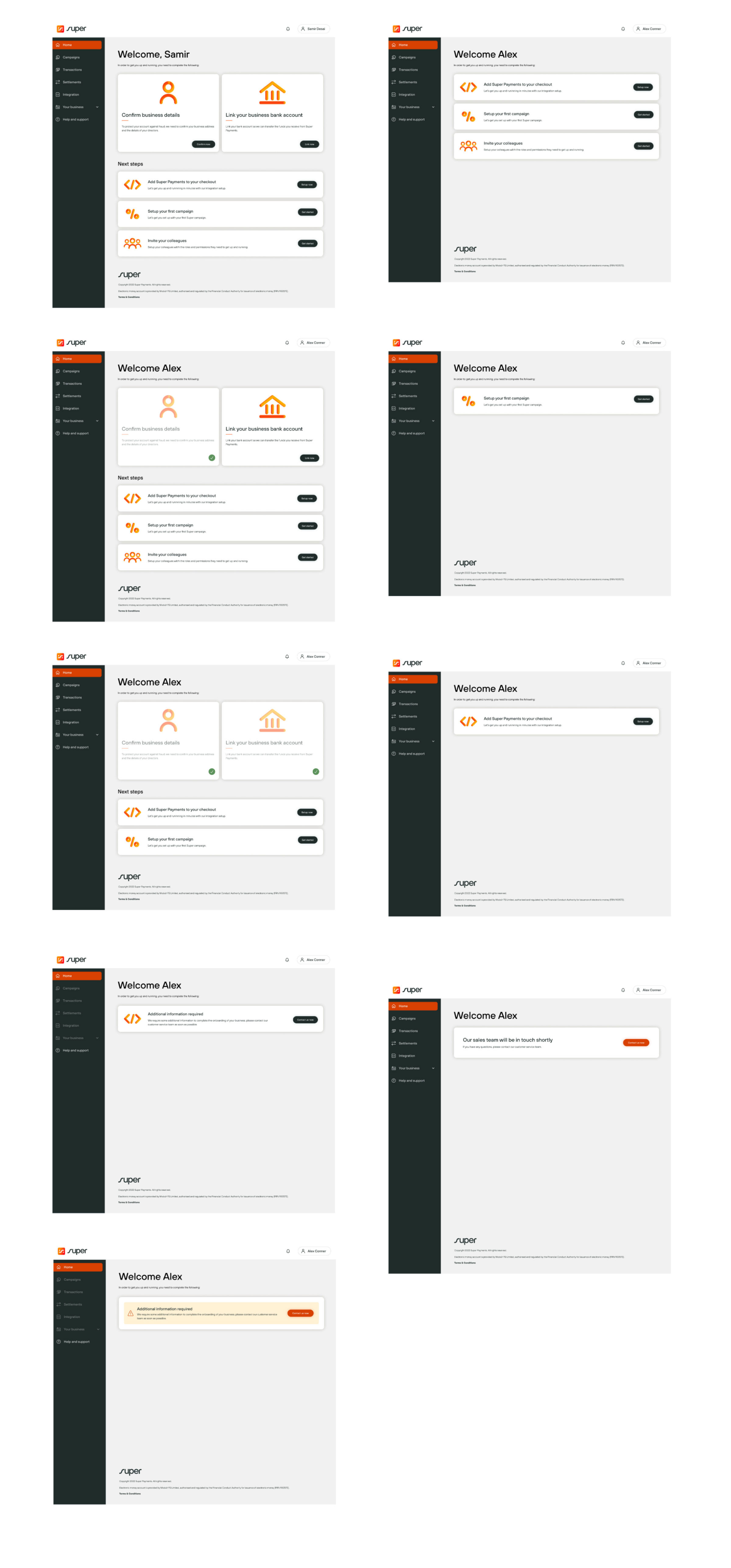
One of the biggest areas of this part of the passive onboarding journey is getting the merchant through the KYB (Know Your Business) process. This can often be seen as long and arduous.
We simplified the process by pulling in any information we had already gathered from the merchant and their business on initial sign-up, leaving only the outstanding information to be completed. Clear guidance was given on each screen to help and support the merchant throughout the process.
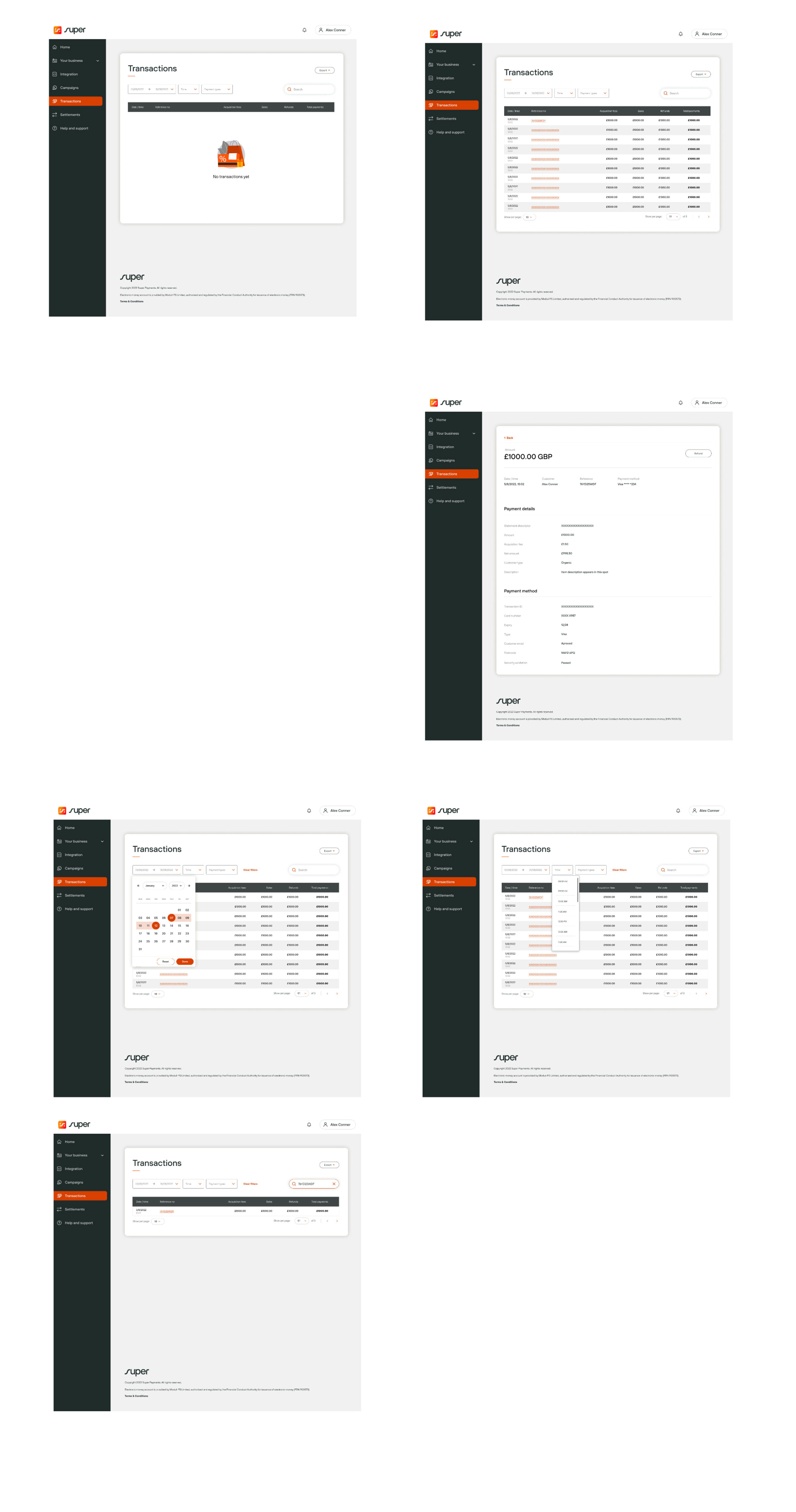
The transaction screens were designed to be simple and clear and allow merchants to self-serve as much as possible. The ability to filter and search was included. All the data needed for an eCommerce transaction and the ability for the merchant to issue a refund was included.
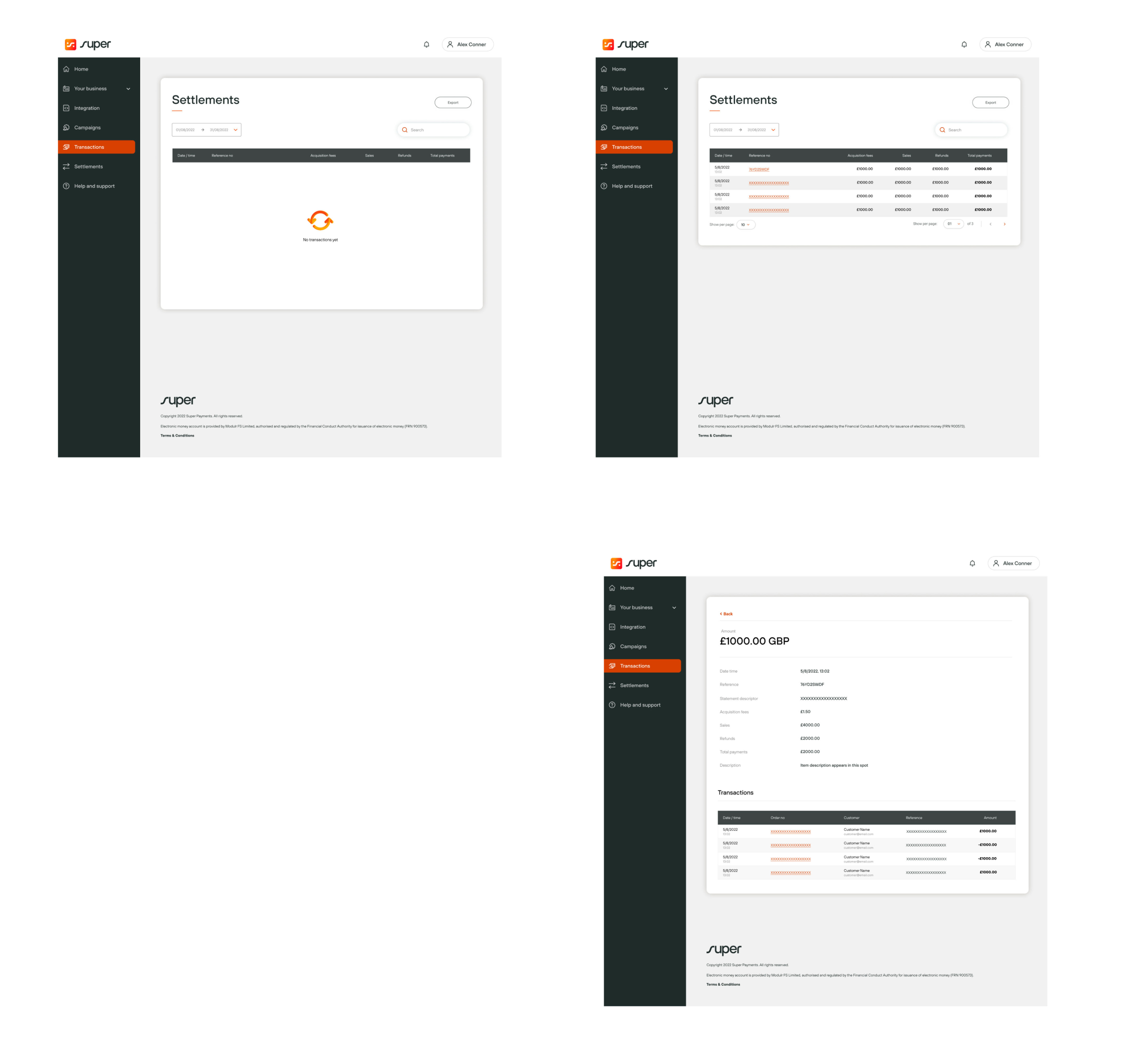
The merchant settlements screen provides an overview of processed transactions, showing detailed settlement information such as transaction dates, amounts, fees, and net payouts. It allows merchants to track payments made to their bank accounts, view pending settlements, and filter transactions by date or status to better manage cash flow and reconcile their earnings.
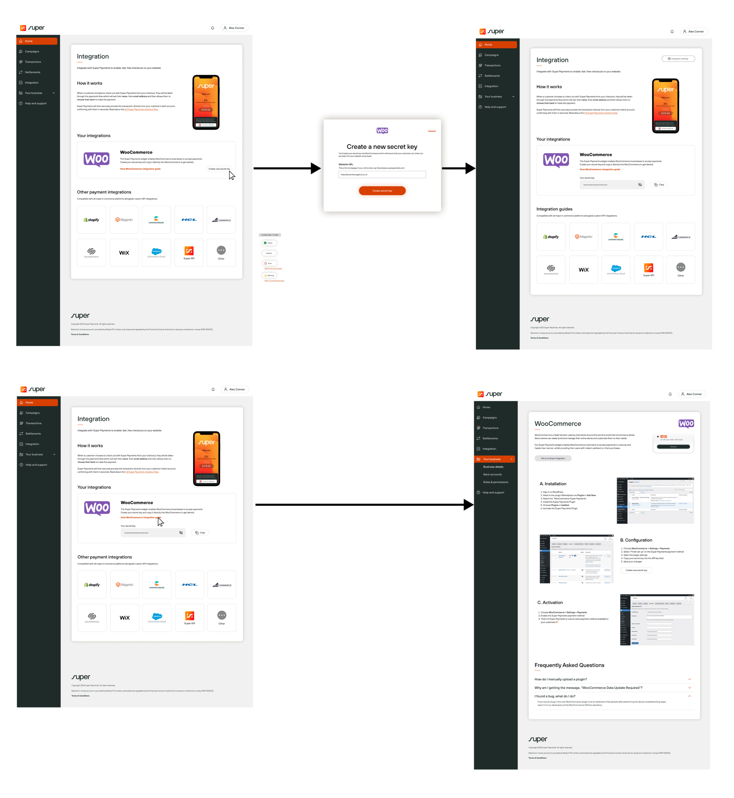
The ability to integrate with the merchant’s current eCommerce platform through the portal was going to be key to adoption and help us stand out from competitors. All major platforms were included in the MVP, with documentation and guides on how to do the integration, with a guaranteed “just one line of code” to be added.
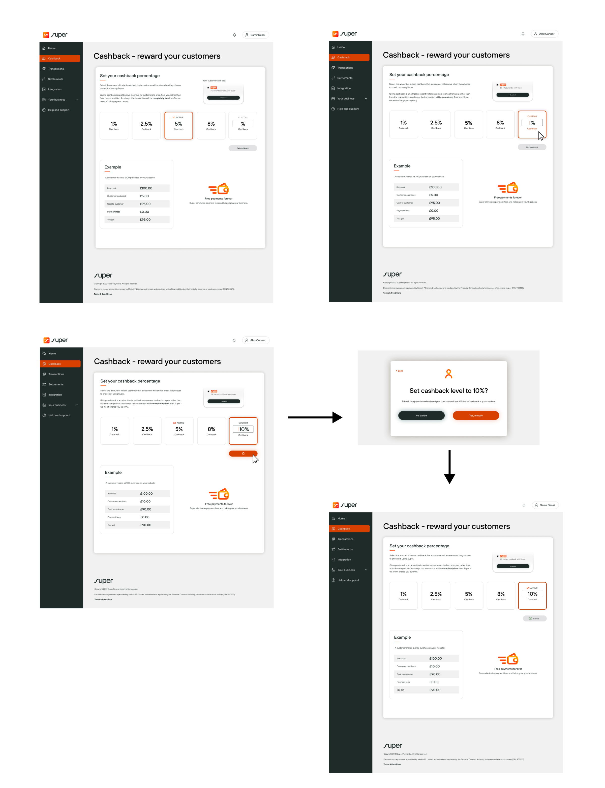
The cashback percentage is an attractive incentive for customers and to create loyalty. The merchant was given the full ability to adjust this percentage to suit their business needs and offer the best cashback reward for their business. The screen gives quick options to select from or the ability to add in their own custom figure. The example calculator updates based on the percentage selected.
This project was going to be driven primarily by business insights, rather than getting an opportunity for user validation. The focus therefore was on building a flexible, data-informed foundation that aligns with business objectives while remaining adaptable for future user feedback.
As found in the kick-off session, the business had a good sense of user needs. So we focused on an MVP approach and prioritised features that were critical to the product's primary purpose, focusing on those that supported initial revenue, brand positioning, and market differentiation.
To compensate for limited user validation we chose to:
Design a flexible framework that allows for iterative changes without overhauling the product.
Use scalable design components to ensure that future adjustments can be implemented efficiently.
Use internal stakeholders or simulations to anticipate user behaviour, ensuring that the design is modular and adaptable for easier iteration.
Implement a robust analytics system to capture usage data and key metrics that can inform ongoing decisions.
Plan to gather structured user feedback post-launch to validate assumptions and make adjustments based on real user interactions.
The resulting design proved successful to the business in addressing their objectives and having a fully functioning MVP of the Merchants Portal.